Pigment Board Assembly Handbook · Version 2.0

Boards anyone can build, that anyone can read.

The TwinSix field guide for assembling Pigment boards. No design background needed: just the order to work in, a few decisions, and a checklist before you ship.
Live by these

The philosophy

Four principles that explain every rule that follows. Absorb them and most decisions make themselves.

Start with who

Know your users

Meet the eight people we build for. Decide who a board serves before you place a single widget; their goals settle what belongs and what doesn't.

Draft before you build

Wireframe first

Rough the board out in FigJam with the TwinSix Pigment UI libraries before touching Pigment. The components carry the grid and spacing, so layout is all you decide.

Live by these

The philosophy

A board is not a place to display data. It's a place to help someone decide something. Everything else follows from that.

01

Design for the user

Build for how your users actually work, not for what's easy to build, and not for what looks impressive in a demo.

02

Drive a decision

If a number doesn't change what someone does next, it doesn't belong on the board. Lead the eye to the few that do.

03

Show less

Negative space is doing a job; it makes the numbers that matter easy to find. When in doubt, take something out.

04

Stay consistent

Every board should look like it came from the same place. Match the layout, spacing, and labels across all of them.

Your boards should look professional and read as clear and engaging — that's what drives intuitiveness and adoption.

The techniques below help eliminate the friction between the user and your content.

Design for the user

Who you're building for

Every board is for a person with a job to do. These are the eight we build for most. Before you place a single widget, pick the one you're serving; their goals decide what belongs on the board, and what doesn't. Open a card for the detail.

BH
Brennan Huff
CFO
"I can't drive strategy if I can't trust the numbers."
Build for them: Board-level KPIs and variance at a glance. Executive clarity: no clutter, no black boxes.
DetailLess

Goals

  • One trusted source of truth
  • Faster budget, forecast & close
  • Scenario planning for uncertain markets

Watch for

  • Data that lands too late to act on
  • Rigid systems that kill agility
  • "Yet another tool"
On a board: Headline numbers first, variance vs. plan front and centre, skimmable in seconds, with auditability underneath.
MH
Monica Hall
VP of Finance
"I want a solution my team will actually use — not another system that sits idle."
Build for them: Standardized, reusable layouts with scenario toggles the team can drive on their own.
DetailLess

Goals

  • Standardize planning processes
  • Kill spreadsheet dependency
  • Faster, more granular reporting

Watch for

  • Steep learning curves
  • Migration risk
  • Losing spreadsheet flexibility
On a board: Consistent templates, comparison and scenario views, clean variance analysis.
EB
Erlich Bachman
FP&A
"If I can't explain the logic behind the numbers, it's not useful."
Build for them: Dense, drill-down tables with transparent logic: let detail expand, never hide the math.
DetailLess

Goals

  • Less spreadsheet wrangling, more insight
  • Self-serve reporting
  • Scalable models that evolve

Watch for

  • "Black box" tools
  • Losing transparency and control
  • More work, not less
On a board: Expandable detail rows, visible assumptions, dashboards that feed executive slides.
OP
Olivia Pope
Revenue Operations
"I spend more time reconciling numbers between Salesforce and Finance than analyzing what they mean."
Build for them: CRM-aligned tables that join Sales and Finance into one view you can trust.
DetailLess

Goals

  • Centralize revenue data
  • Forecast accuracy across GTM
  • Scalable hiring & comp models

Watch for

  • Weak Salesforce integration
  • Access & permission gaps
  • Duplicating existing dashboards
On a board: Pipeline, quota and headcount tied together, permissions-aware, with clear filters.
SS
Spencer Strasmore
VP of Sales
"I need to know today whether I can greenlight another AE for EMEA."
Build for them: Fast pipeline KPIs and headcount by region. Speak Sales, not Finance.
DetailLess

Goals

  • Forecast revenue & resource needs
  • Optimize headcount by territory
  • Pivot with the pipeline

Watch for

  • Slow, finance-centric tools
  • Hidden assumptions
  • Rigid budgets that don't match the plan
On a board: Top-line KPIs, territory views, quick filters, minimal finance jargon.
MP
Miranda Priestly
VP of Marketing
"I can't wait two weeks to get a forecast update."
Build for them: Budget-vs-actuals and channel ROI: visual, self-serve, quick to reallocate.
DetailLess

Goals

  • Real-time budget vs. actuals
  • Prove marketing's revenue impact
  • Agile mid-quarter spend

Watch for

  • Steep "finance tool" learning curve
  • No visibility into her own numbers
  • Rigid, locked-in categories
On a board: Spend by channel, ROI to pipeline, self-serve budget views: visual first.
HE
Helena Eagan
Director, People Ops
"We need to see, in one place, what roles are filled, open, or frozen — and the budget impact."
Build for them: Headcount tables with filled/open/frozen status and budget impact; hierarchy that expands by team.
DetailLess

Goals

  • Align workforce plans to budget in real time
  • Visibility into open roles
  • Automate headcount & comp modeling

Watch for

  • Stale hiring data in forecasts
  • Constant manual syncs
  • Losing control of workforce data
On a board: Headcount status tables, expand/child rows by team, vacancy and budget impact.
HP
Helen Parr
Controller
"If it doesn't tie out, it doesn't go out."
Build for them: Auditable close views that tie out. Precise, consistent formatting: rigor over flash.
DetailLess

Goals

  • Fast, accurate close
  • Full audit trail & data lineage
  • Standardized reporting across entities

Watch for

  • Losing control of the close
  • Tools detached from the GL/ERP
  • Flash over rigor
On a board: Reconciliations and tie-outs, immaculate number formatting, zero decoration.

"Know the person, and the board almost builds itself."

See it first

The TwinSix secret sauce

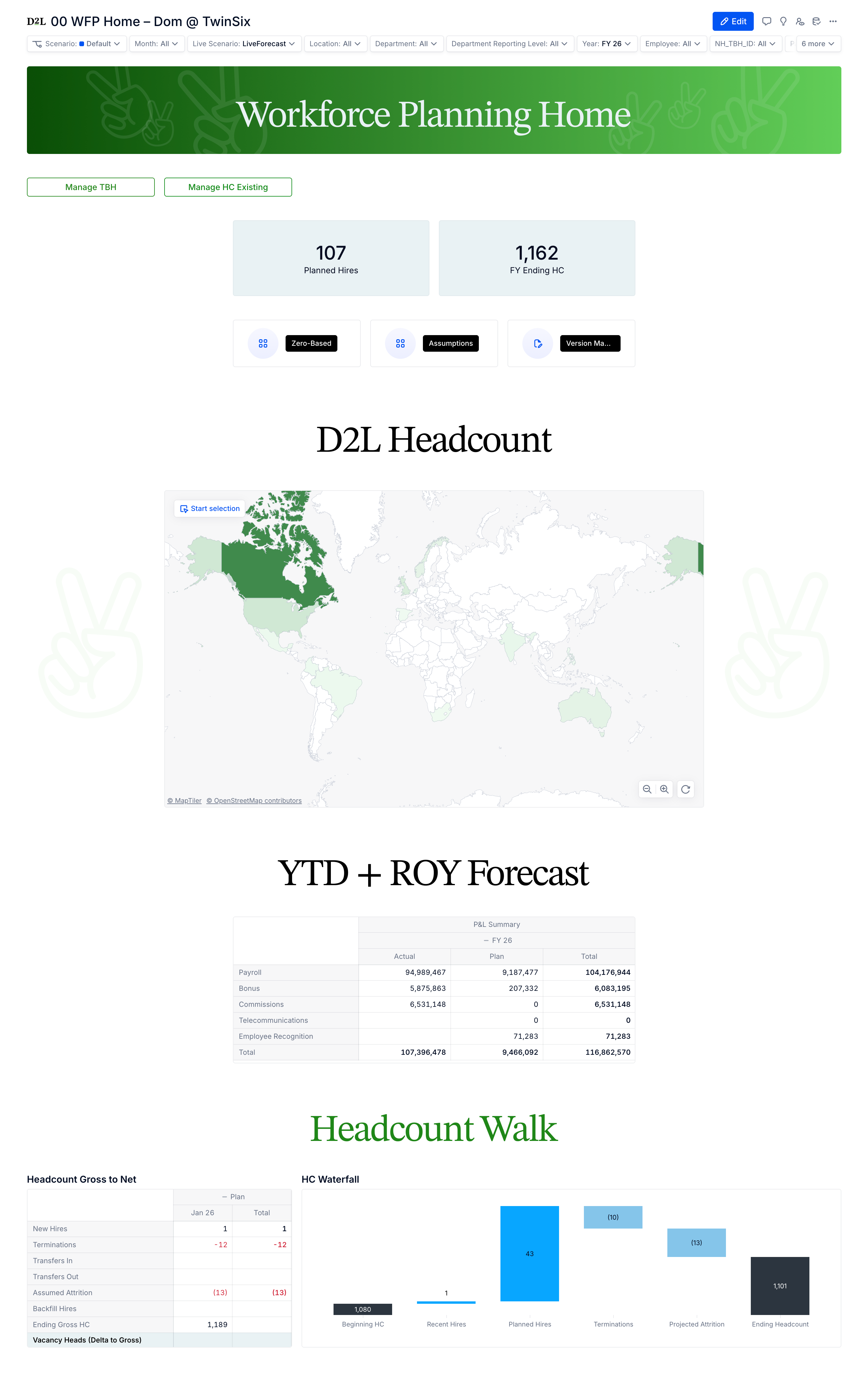
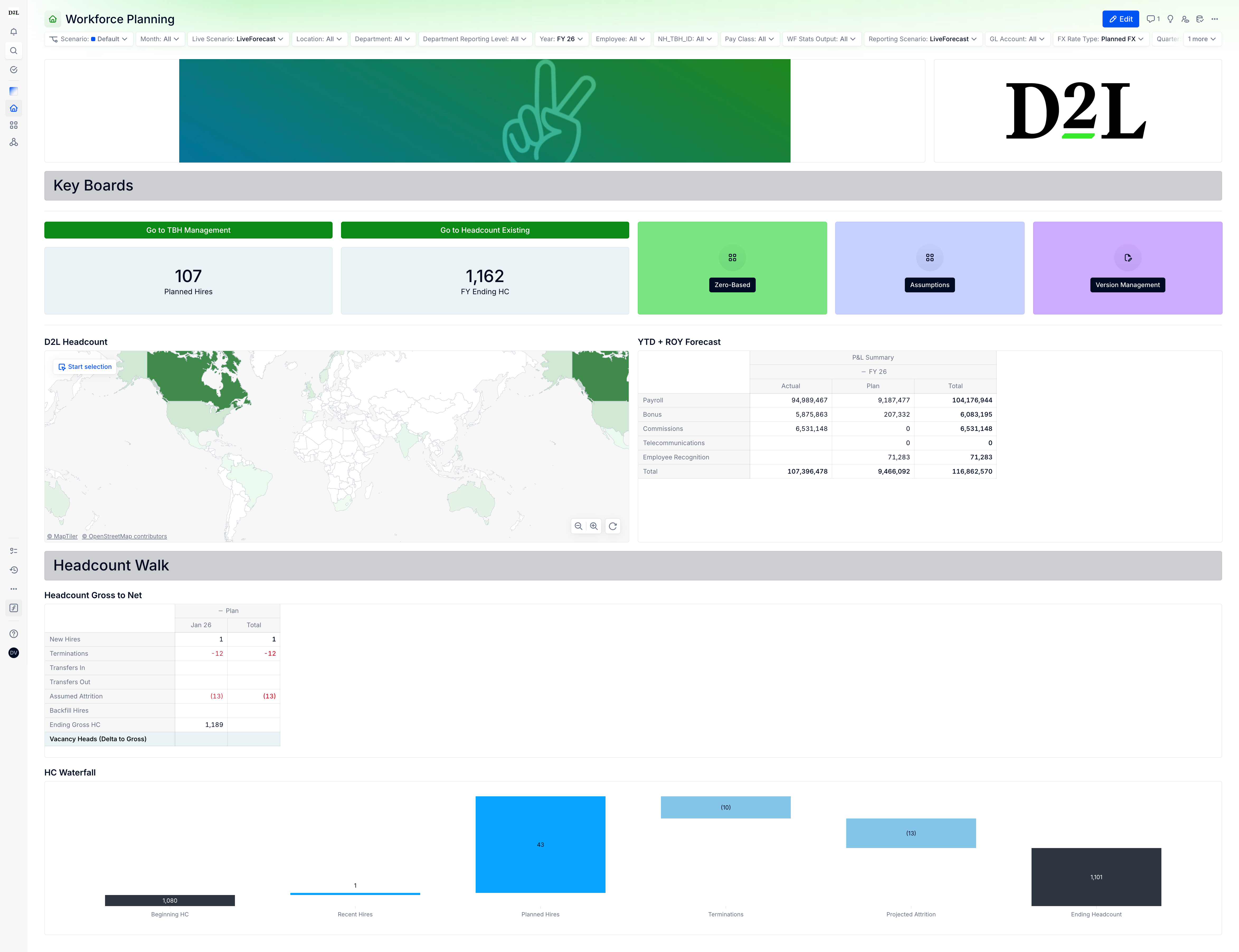
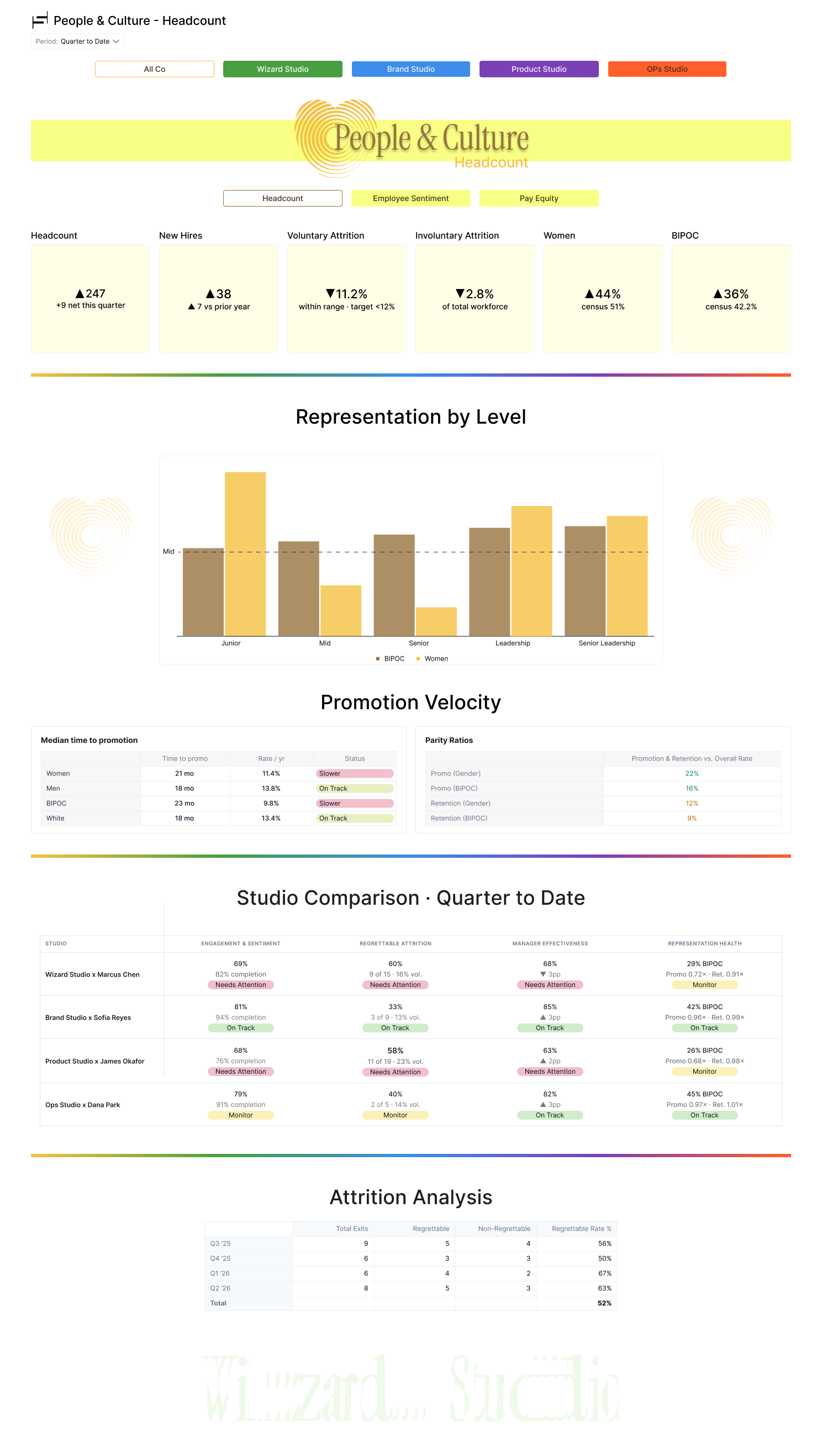
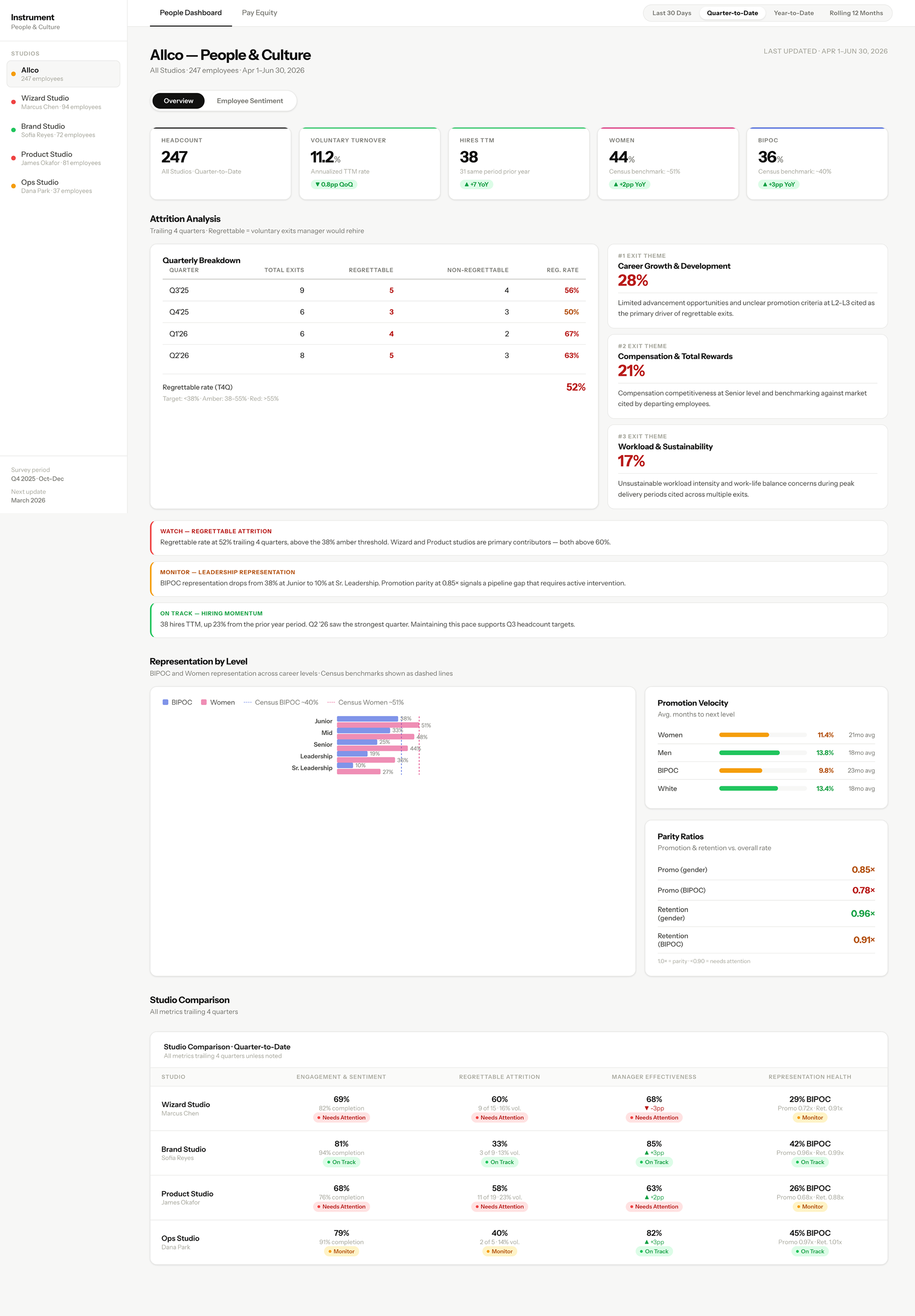
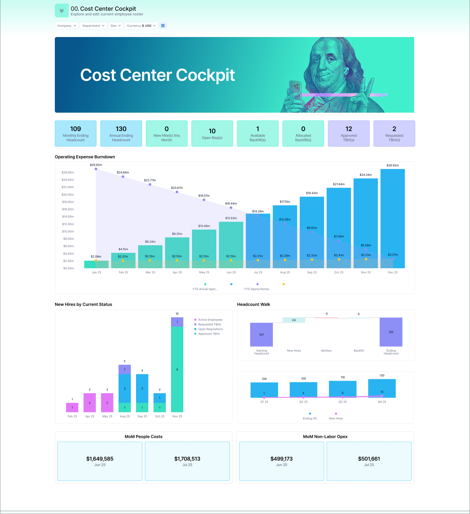
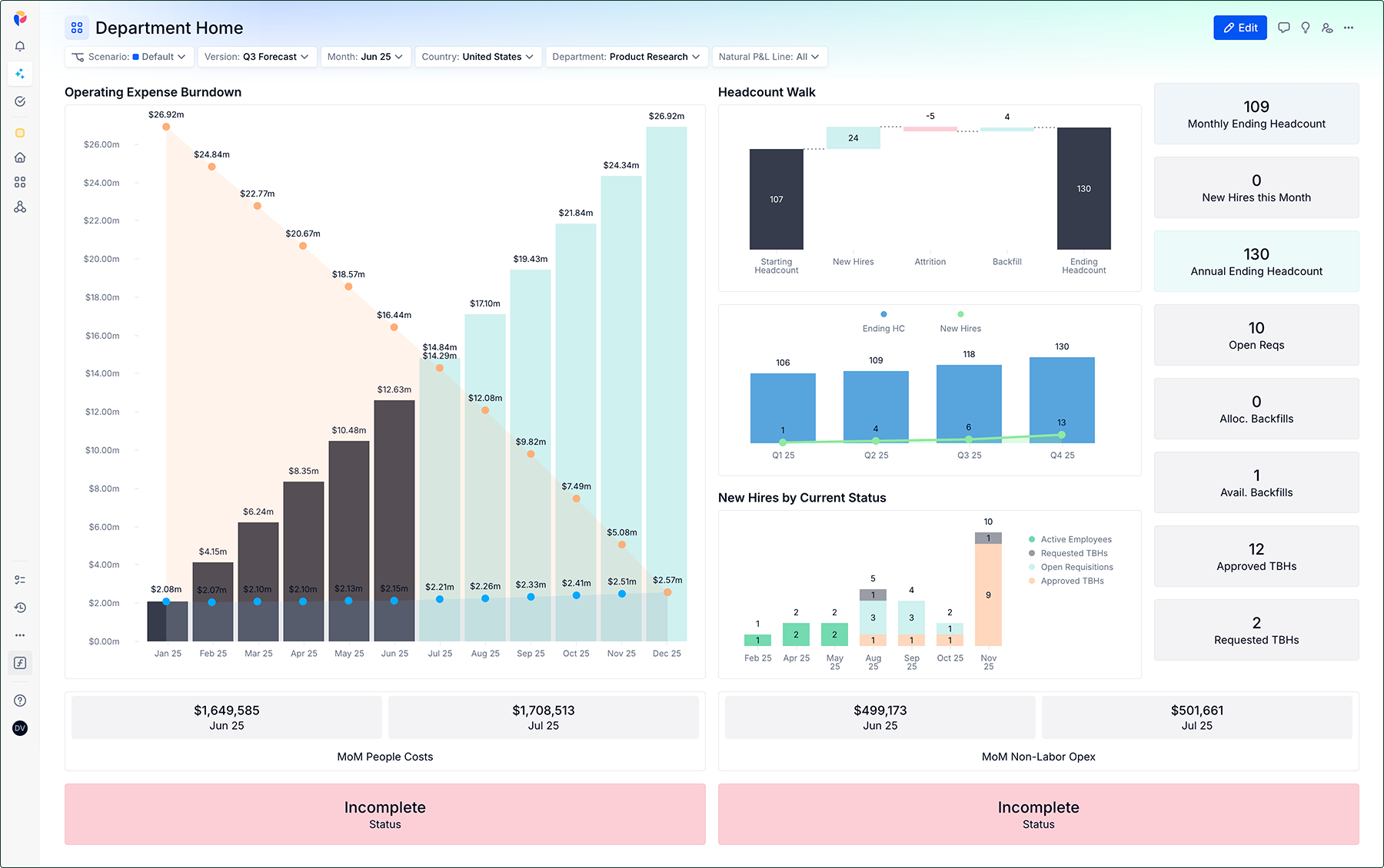
A few real boards with the secret sauce applied. Flip between Before and After to see the difference. Use the arrows to browse the examples.

Draft before you build

Wireframe it first

Once you know who you're designing for, you can start sketching. Rough out the layout in FigJam with the TwinSix Pigment UI libraries (blocks are cheap to move here), then rebuild the approved version in Pigment.

You never measure a thing. Every component in the TwinSix Pigment UI libraries is already built to the Pigment grid: widths, gutters, masthead and spacing are baked in. Drop widgets in and they'll snap in place. The only thing left for you to decide is the layout.

First do this

Open a FigJam file. Click the "+" at the right of the bottom toolbar, choose "Stickers", then "Add your own" under the Libraries section. From there, you can add the four libraries below.

LibraryWhat you'll grab
Pigment Layout LibraryFilters, masthead, headers and KPI widgets
Pigment Chart LibraryBars, lines, donuts — pre-styled
Pigment Table LibraryFrom basic to more complex tables
Pigment Template LibraryWhole board layouts to start from, by theme

The flow

Draft, review, then build. Most of the thinking happens before Pigment.

  1. Begin drafting in FigJam — start from scratch or from an existing pattern.
  2. Review the wireframe — with whoever owns the board. Implement feedback, review again and repeat until happy.
  3. Rebuild it in Pigment — with the layout settled, assembly is quick and the grid is already right.

"Moving a block in FigJam costs seconds,
not a rebuild."

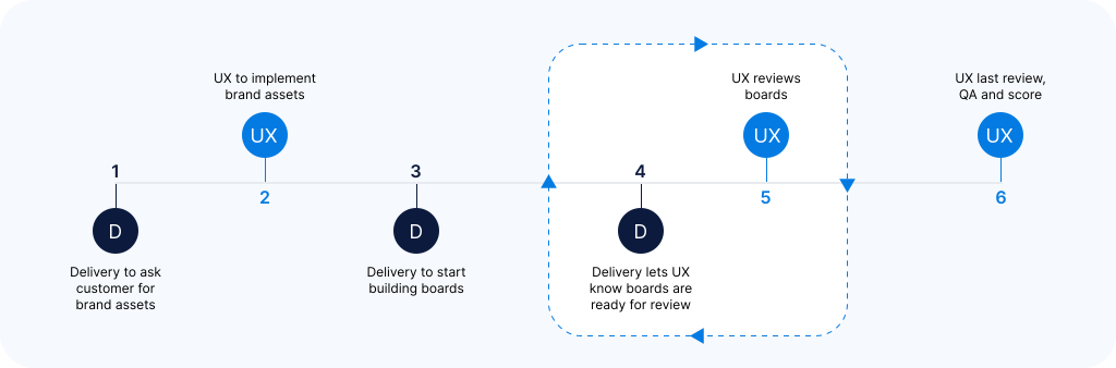
How we work together

Workflow

When to bring the UX team in, and what to expect at each step. The earlier UX sees a board, the cheaper it is to get right.

TwinSix board workflow — when and how to engage the UX team across the process
Work from this

The playbook

Six things that cover almost everything you'll build. Follow the default; the exceptions are rare and always called out.

Layout

  • Turn off "Make board full width" in the Format menu.
  • Choose the customer logo to feature as the image in the Pigment header.
  • The accent color is UX's call: they decide the color, and whether to use one at all.
  • Always place an image widget at the very top to hold the masthead graphic UX creates.
  • Embrace negative space: as a rule of thumb, add a Spacer widget between each main row. Exceptions apply; lean on the UX team when in doubt.
  • Never let the last widget butt against the browser edge. Use a large horizontal spacer, or an image widget hosting a UX-designed footer.

Pick a chart

Comparing categories
Use a bar or column
Change over time
Use a line or area
Part of a whole, at a glance
A donut — sparingly
Spread of values
A histogram or box plot
When in doubt, a bar chart is rarely wrong. Avoid pies and donuts for comparing sizes; people read lengths far better than angles.

Colors

  • The UX team will have plugged the brand colors into Pigment already.
  • On pill cells, make sure the pill color and the label color have enough contrast to stay readable; a black label on a dark-grey pill is hard to read.
  • Colors for primary, secondary and tertiary CTAs are pre-defined by UX (see Buttons).

Filters

  • Order filters by how often they're used: most-used on the left.
  • Every filter earns its place. Rarely touched? Minimize or hide it.

Buttons (CTAs)

We call buttons Call to Actions for a reason: they show users their options, set expectations, and point to what's expected next.

  1. Primary: the main action, tied to a key widget: "Add Employee".
  2. Secondary: navigation between boards.
  3. Tertiary: lower-stakes moves like "Back to Cockpit".
  • UX sets button colors to reflect that hierarchy.
  • Every label on a button should start with an action verb (Add, Submit, Process, Sort) to set expectations and lift engagement.
  • Fill in each button's tooltip info to ensure proper accessibility.
  • Aim for about 2 grid columns wide. Icons are fine when they're relevant.
  • Buttons in a navigation system keep the same order board to board, so users never get lost.
  • Navigation needs a clear selected state so users know where they are; UX decides the treatment.
  • Above all, keep button style consistent across every board.

Headers

Use headers to group widgets and break long boards into chapters.

  • Spread the text widget across all 12 columns so nothing shifts.
  • H1 is usually the right tag for size.
  • UX decides the type treatment: left vs. centered, sentence vs. title case.
  • Graphic dividers can group widgets and separate sections; UX provides them when needed.
  • Above all, keep header style consistent across every board.

The Spacer widget is your best friend.

Every board, before it goes out

Before you ship

None of this needs design taste: it's all yes or no. Run it on every board.

Layout & alignment

Board header & icon

Filters & content

Buttons

Tables

0 of 25 checked

Reference

The lexicon

Plain words from the UX world.

Categorical color
Different colors for separate groups.
CTA
Call to action: typically a button that tells the user what they can do next.
Diverging color
A scale with a neutral middle and two directions.
Masthead
The graphic title strip at the top of a board.
Negative space
Empty space you leave on purpose, so the rest stands out.
Progressive disclosure
Hiding detail until someone asks for it: the +/− rows.
Sequential color
One color going light → dark to show low → high.
User
Part escape artist, part goldfish, and our ultimate muse.